It’s been an exciting few years for us at Blocto, and we wanted to refresh our brand identity to better reflect our core values and mission as we move forward. In fact, eagle-eyed Bloctopians may have already noticed over the past few months that we’ve slowly been changing up our visual style!
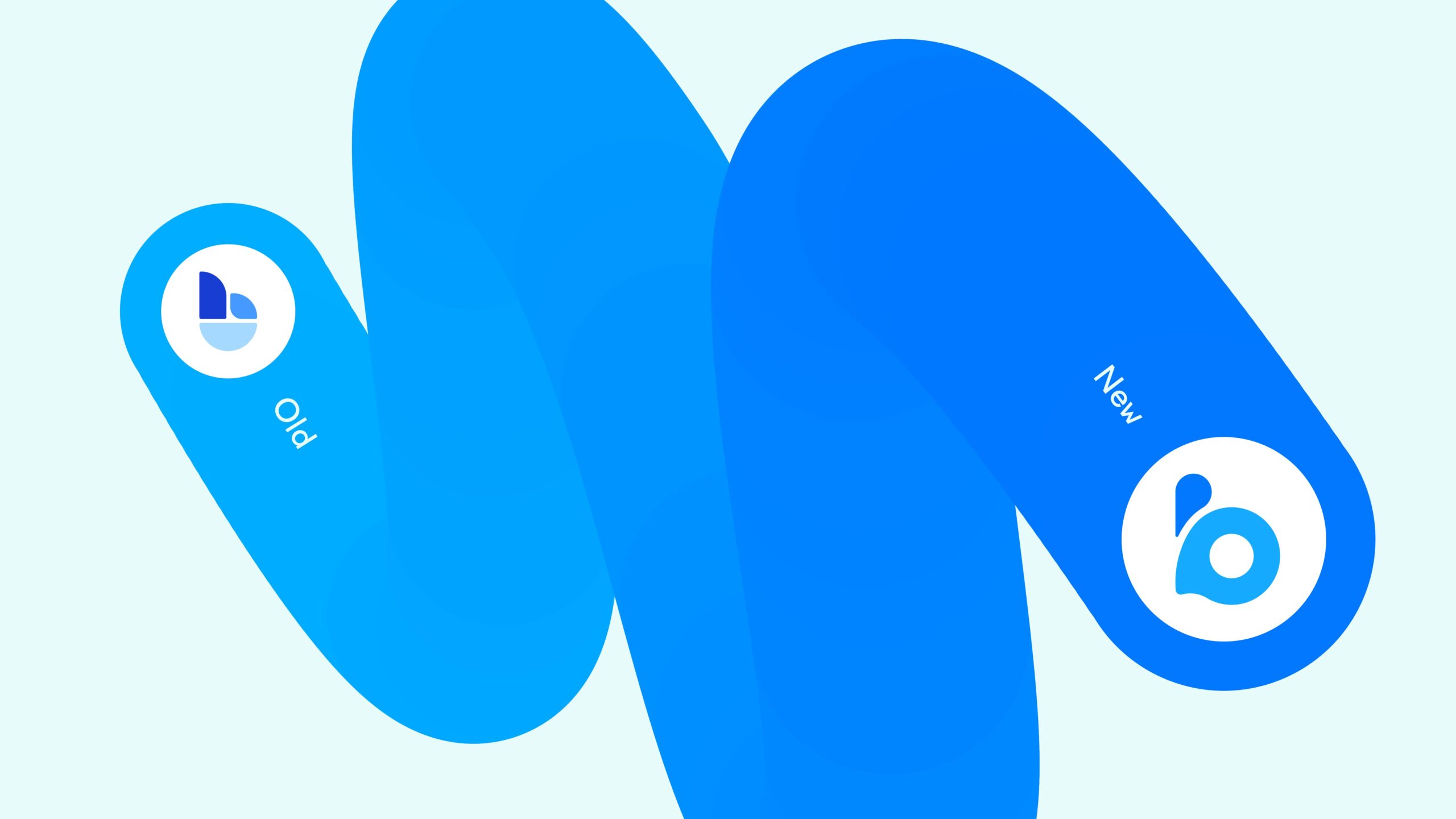
The Blocto team has been hard at work, and now it’s finally time for the big reveal! This week, we launched the new Blocto logo. Take a closer look below. 👇🏼
From our more muted beginnings, we now use more vibrant shades of blue in our logo and color palette to express our visual identity. We also used water droplets to make up the letter ‘b’—a clear callback to our oceanic origins. Did you know that ‘Blocto’ came from “blockchain octopus”? 🐙 Our founders envisioned Blocto to be your smart Web3 companion that can help you do a lot of things, like an octopus with eight legs! And just like water, we aim to be constant yet adaptable—moving with the current as it ebbs and flows.
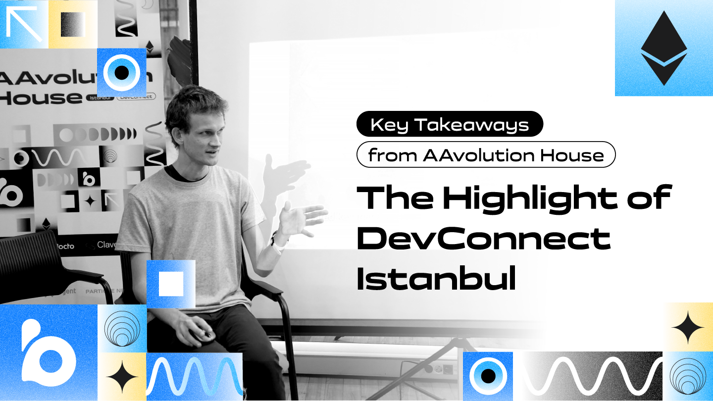
Another thing you may have spotted already is the Blocto Current. Weaving in and out of each image, this creative expression is a fun and dynamic way to tie everything together. Recalling ocean waves, it adds movement and catches attention.
Though this is pretty exciting news, it’s not the end yet. Blocto is in the process of rebranding, and our new logo is just the first of a number of visual changes you’ll be seeing over the next few months. Join our community to be the first to know!
Join the Blocto Community
Website | Medium | Twitter | Facebook | Instagram | Telegram | Discord | Github | Linkedin

